Untouchable screens
Almost every week, at least once - especially during my lunch break – a strange experience presents itself to me. While trying to quickly stuff my mouth with a sandwich or a delicious bag of greasy potato chips, I find myself simultaneously browsing my cellphone with my other hand—usually for pointless Facebook updates or online fashion sites. Of course, if I suddenly get an urgent email or just hear that inner voice nagging me to get to work, I turn my attention back to my laptop and, without thinking, use my finger to touch my
untouchable laptop screen—with oily fingers of course. Quickly, I try to use my other greasy hand to clean the screen. If I’m lucky, nobody notices this small ritual of mine and I am able to laugh at myself as I think about what a “ touching mess “ I find myself in. We live in a temporary era among touchable and untouchable screens. For work, most of us use the classic laptop or monitor screens. But for play (especially during our lunch breaks) we naturally use the touch screens of our smartphone or Ipad. As we find ourselves having to switch back and forth between the two types, funny accidents occur. As a designer, I work
—for the most part—with my laptop. Work-related issues are generally dealt with on my computer, while browsing for fun is dealt with on my phone. This method has a natural pattern to it.
Touching is for fun while working requires external tools; like touchpads or mouses. Touchable versus untouchable. Heavy versus light. Work versus fun. This pattern has a scary voice to it. How do my mouse or touchpad have the ability to separate
my everyday actions? As a not-quite-grown up in a grown up world, being able to work from real passion is only a recent experience for me. I love the feeling of working from passion. Why must I separate the ‘fun’ from my ‘work’? I would rather combine the two.
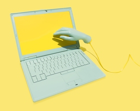
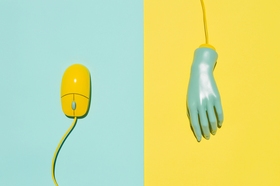
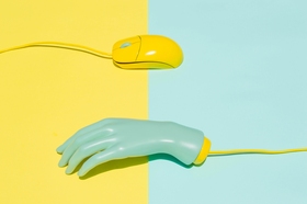
The Dead Mouse
Meanwhile, as we make the switch between touchable and untouchable screens, we have to leave the “old” mouse yet still turn back to it every now and then. The mouse, as a substitute for our hands and fingers,
was invented during World War II. It was a military secret for ages and only reached it’s final form in the 1980’s. The present day cursor was created by Xerox engineer Douglas Engelbart in 1981. The cursor was originally designed as a small arrow pointing up. However, on the low-resolution displays common at that time, it was so difficult recognizing a small vertical line on the screen, so Engelbart rotated it 45 degrees. Surprisingly, the first touchscreen was actually invented about 20 years prior to the invention of the domestic mouse. The touchscreen was first created in 1965 by E. A. Johnson.
Although we tend to think about touchscreen computers as the wave of the future, according to their dates of inception, they’re actually a retro fashion trend. It would appear then, that time is a relative ingredient for our everyday tools. We may wonder then, why do we still use the mouse? But this isn’t even the right question to be asking. Rather, we must ask ourselves to search for a translation between the two languages of touching and using external tools for touch. We have created a new and secret gesture of language for our touch screens, which is impossible to decode or translate for our archaic, untouchable
computer screens. Instead of searching for a solution, perhaps we should instead focus on creating a dictionary for this temporary period.
The difficulties of using tools reminds me of a recent dinner I had with my
husband at a Korean-fusion restaurant. The meal was delicious. It was the perfect marriage between European and Korean cuisine, so savory that even our native-Hungarian tongues were pleased. However, there was one disappointing aspect to the evening— instead of giving us chopsticks, they served our meal with forks. Aside from the near-impossibility of using a fork for that type of cuisine, it had already taken us ages to learn how to master chopsticks. So finally, my husband and I had to ask for them in order to finish our dinner comfortably. No matter the location, we are constantly having to switch between new and old; traditions
and fusions, all the while trying to find the right tools for the occasion.
The Horizon
When I was a child my favorite book was a picture book about birth. The book was full of unimaginably beautiful illustrations without a single word. As a four year old, I had never heard anything about our origin and didn’t have any idea how I had arrived into the world. Therefore, the illustration with the most significance for me was the page with the drawing of the womb. I can still recollect every single detail of it. At the time, I didn’t
need to understand that illustration; I felt it. The power of the book was in its story— the story I had never heard about but somehow already knew. It had a clearly understandable horizontal line. Every single picture acted as a word following one after the other. All together, those “words” created a story. My story.
In western culture we typically read from left to right. This is the way we learn to decipher and create our stories, regardless of whether the structure uses pictures or words. These days, instead of using picture books to inform myself, I now collect
information from websites. All web pages have one thing in common— they work vertically. But these web-pages aren’t story-tellers. They are long vertical roads of information. Frank Chimero brings our attention to
this issue in one of his most entertaining writings. According to Chimero’s article Horizontalism and Readability, a really strange decision was made in 1984—the same year I was born. The designers and developers of Macintosh had to face and solve the problem of pagination on computer screens. How could so much information fit into such a small screen? To arrange and fit infinite content, the developers had a genius idea; they invented the scroll. And accidentally, they created it in a vertical way. If we take a look at a physical scroll like the Dead Sea Scrolls for example, we can easily see
that the opposite horizontal workings are at play. As Chimero points out in his own unique way-  “ A simple Google Image Search will reveal the same sort of pattern. “ Of course, it’s doubtful that the Macintosh
designers and developers ever had the chance to test his theory. In 1985 the scroll wheel quickly became the mouse’s super power. With its’ perfect ergonomic design, it’s not even a question that positioning it in a vertical way was a good idea. However, what’s most comfortable for our forefinger may not always be the most comfortable to our eyes. It’s pretty interesting that the whole world changed the moment the scroll was born. Our reading habits and ways of processing information changed dramatically. Today we are used to dealing with really long sentences while reading online. Thanks to the
scroll, although it’s now possible to keep the sentences in our horizon, it can be all too easy to get lost in endless inarticulate texts. Due to vertical arrangement, texts have left their earlier form; they’re not separated into columns like newspaper or magazine pages. This form finds itself more suited to quick skimming than deep, serious reading. We can’t say with certainty that only one direction is the solution. Good solutions are infinite, and each direction has its advantages and disadvantages. But If touching is the wave of the future, then change is inevitable. The mouse and its super power are bound to become extinct
and with our finger as the guide, we won’t need directions and rules anymore. We will be able to travel freely, exploring and creating all possible directions in the online universe.
Touching the Untouchable
Personally, I never use a mouse. Maybe that’s why my awkward lunch-break touching incident keeps happening to me. I know it may sound crazy, but I use my touchpad for every single design task. Like most of us, I still work with regular monitor screens so, I was excited to create a solution which would make our everyday switching lives a little easier. I assigned my portfolio site to be a playground of sorts— a field of experiment dedicated for the final days of untouchable screens.
I appointed 3 guidelines to follow while designing my site:
1. To make it touchable.
2. To have it in a horizontal way.
3. To keep it minimal
Defining the parameters of my work is important for producing a system. Without those parameters it would be all too easy to lose consistent content; or worse—the destination. I wanted to create a method that would work well with both touchable and untouchable displays. As a new approach to responsive design, I experimented with a direction that would fit
properly for both mouse and hand control. My original purpose was to create a portfolio site that would act as a frame and also serve to highlight my professional work. Therefore, I adhered in keeping the design as minimal as possible. From my observations, the best ideas are originally dirty. Like humans, ideas are born in a messy way. To make them come alive and be understandable, we first have to clean them up. Occasionally, we need to scrub them in order to reach the perfect level of minimalism. For quite a while, I wasn’t able to understand abstract art. Therefore, I stubbornly
insisted on dealing only with figurative art. I always loved sensitive textures, surprising compositions, and unaccountable colors but I never thought that I would be able to tell my story in the language of minimalism. But I recently came to the realization that the details are the most important part to the whole picture. If we don’t put the details in their proper places and clean up the inappropriate ones, we’ll never reach the desired perfection.
The mouse is still alive
I tried to make fusion cuisine like an
international chef. I used both fundamentals and mixed our touch screen gesture language with the basic desktop cursor. Trying to visualize my goal, the new cursor became a fusion of a fingerprint with the old arrow shaped cursor. In my project, the cursor will now also have some new functions. The recent duties are really similar to touchscreen gestures. There will be a new Swipe and Drag function. The Swipe will replace horizontal scrolling and will imitate the feeling of swiping alongside a page with our finger. Therefore, the Drag function will be similar to turning a page in a book. The light pink circles will
represent the symbols of pushing, and the separated colors can be used to distinguish the directions of the signs. According to Jakob Nielsen’s survey from 2010, people really hate horizontal scrolling; they find it awkward and cumbersome. Nielsen also lists scrolling among the top 10 web design mistakes of 2002. Therefore, in my site, the Swipe and Drag function will replace scrolling. These new functions will become active on the edges of the displays. In the end, I arrived at an important conclusion — thanks to these new functions. Who could have predicted that the mouse — who had always
substituted our finger — would have to learn new ways of touching? The mouse taught us how to control our virtual world, but we have passed by him already. So this time we have to turn back and teach our new gestures to him.
One solution is on the horizon
While I tried to imagine that my laptop screen is a touch screen, I couldn’t deny an important fact: it would be impossible to navigate vertically. If I could manage to reach it, I would have to hold my hand in a really uncomfortable position and continuously move it up and down. Doing this, I would look like a T-rex with my short hands. But fortunately, touch screens weren’t designed for dinosaurs. Therefore, I’ve decided to tell my stories horizontally but in an unusual way. Meaning, the veteran horizontalism is the basic unit of my
storytelling but it’s done in a virtual context. This new environment also gave me the opportunity to explore the advantages of this direction. Long vertical pictures are perfect frames for unusual visual gag jokes and additionally, they have a unique look. Apart from the touching issue, I also wanted to experiment with reading and texts. I tried to recreate the original printed pagination when I designed my blog’s interface. For example, I organized my articles in old- fashioned columns so that the texts would be clear and easy to read. The texts are therefore separated into single pages. From a designer’s point
of view, composing a horizontally controlled site is more transparent than vertical layouts. Interactive and web design should always be able to handle the problem of ever-changing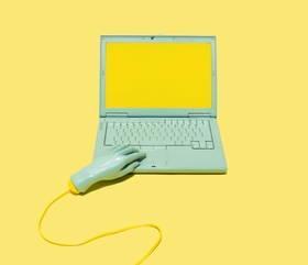
content. Straight horizontal layouts force you to think about typography in a cleaner and more detailed way than vertical layouts do. While the typography in horizontal layouts are fluid, vertical layouts keep it contained. The expectations about what a portfolio site’s design should look like are always different when compared to that of general web design. Portfolio site designs have to contain high doses of creativity more so than everyday problem solving. But regardless of the topic of our work we should discover as many new directions as we are able to. The whole experiment led me to one final point
—the shape of our screens are the frames of our thoughts. We should then think about our computer screens as a mirror, not as an old picture frame. A mirror that is able to reflect our constantly evolving personalities.